I Mean What I Say
"A fluid fusion of abstract motion, vibrant hues, and captivating design that kept audiences craving more."

Client
Rock WylerIndustry
Recording, EntertainmentServices
Graphic & Motion designDeliverables
Collateral, Motion GraphicsThe Ask
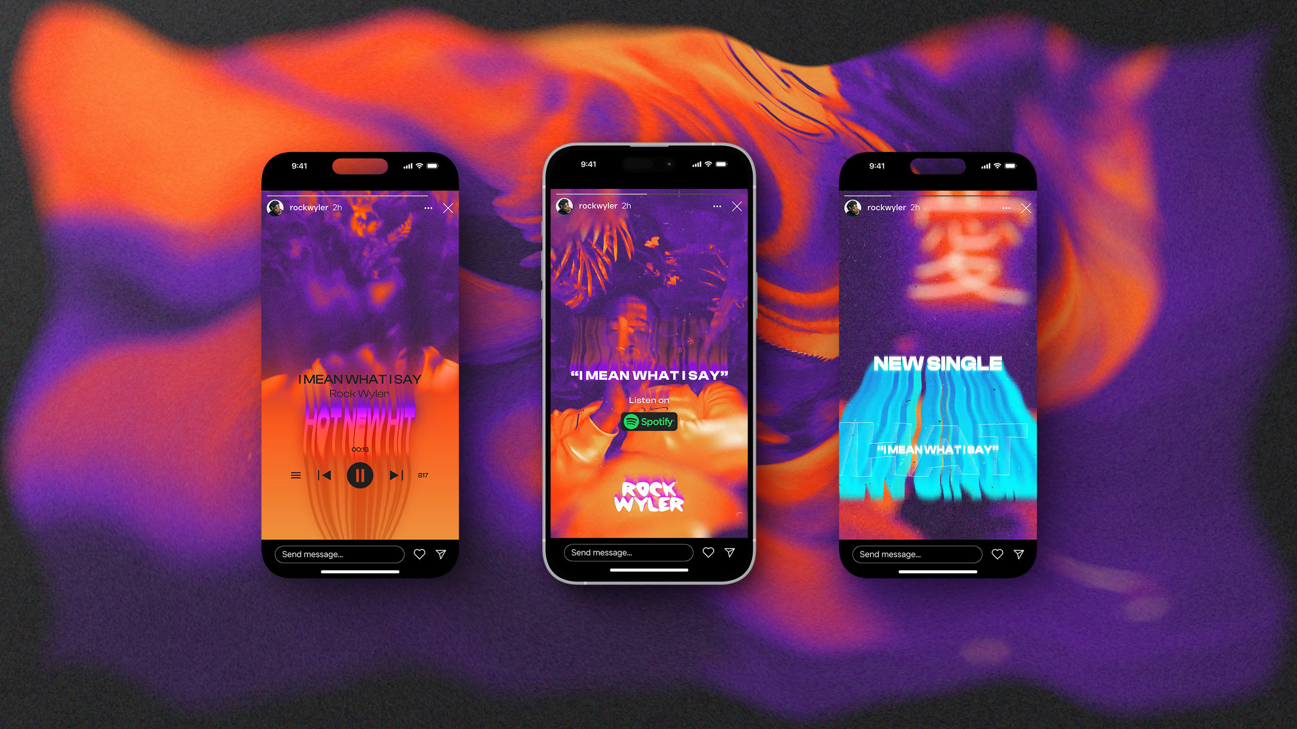
Rock Wyler approached me to develop an eye-catching motion design campaign for his new single and music video, “I Mean What I Say.” He wanted to reach a fresh audience across social platforms, drive up engagement, and keep the visuals feeling dynamic and forward-thinking. My role was to create a set of short promotional videos and cover art that would simultaneously intrigue viewers and direct them toward his new track.
The Development
To capture the essence of the single’s vibe, I immersed myself in the song and its music video. Drawing inspiration from subtle lighting effects in the footage, I developed a color palette dominated by vibrant purples paired with warm gradients of burnt orange and yellow. I explored abstract, melting-type animations influenced by a retro-psychedelic aesthetic and amplified by a contemporary energy. Throughout the process, I balanced the need for a cohesive campaign look with platform-specific considerations, ensuring that every piece—whether a short social video or a static cover image—felt unified yet adaptable.
The Design
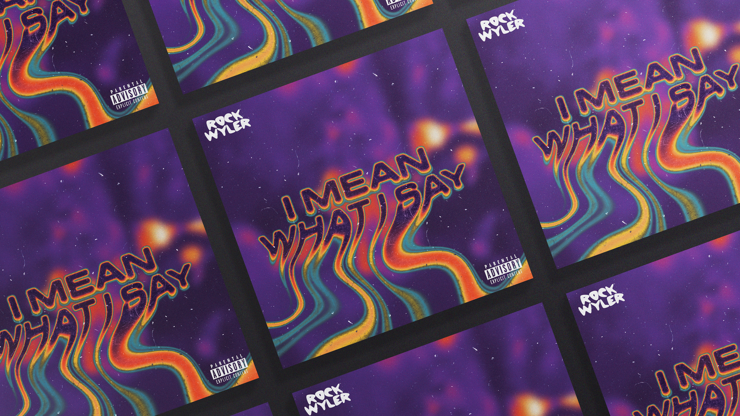
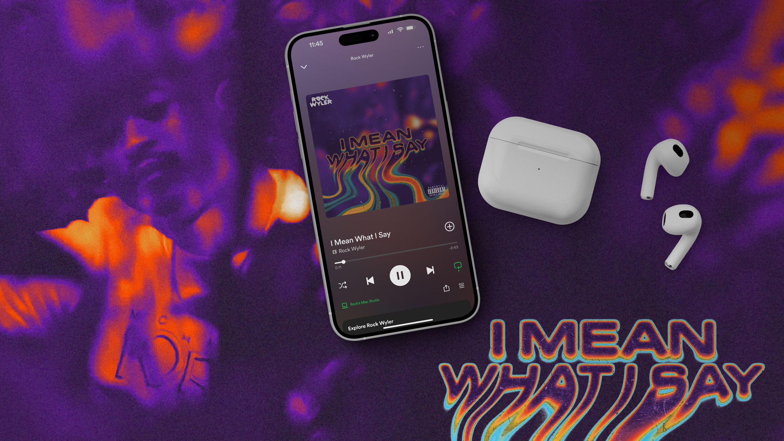
In the final assets, I delivered three distinct 15-second video animations that played with melting typography, flickering noise textures, and vibrant gradients to emphasize the track’s name and mood. A DSP-approved single cover embraced the same color scheme, spotlighting a snapshot from the music video to reinforce brand continuity. Two square flyers for social posts rounded out the package, echoing the same color language and style. By fine-tuning the palette and cutting unnecessary elements, I kept viewers focused on the music and its evocative visuals.
The Takeaway
I handed over high-resolution video files tailored for Facebook, Instagram, and TikTok, along with the single cover and flyers perfectly formatted for streaming services and social feeds. Rock planned to deploy these visuals across his social channels, email blasts, and even share them with interested music blogs. While it’s early in the campaign, he’s already noted an uptick in followers. From this project, I reaffirmed the power of bold color choices in grabbing attention and learned how carefully chosen visuals can elevate a musical release, making it more memorable and shareable.
Next Project
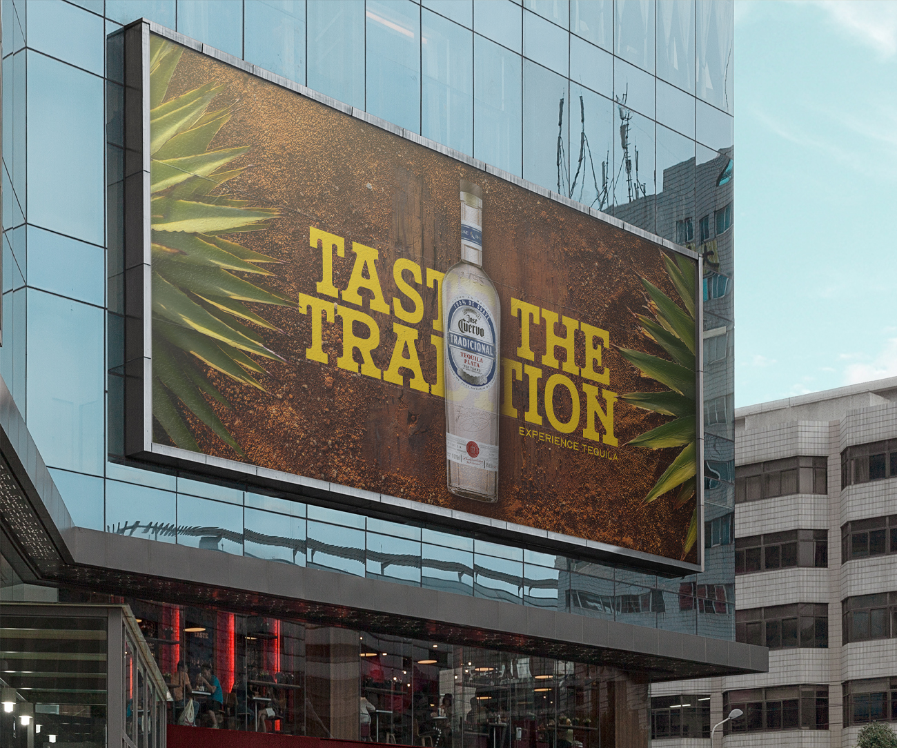
Jose Cuervo®


